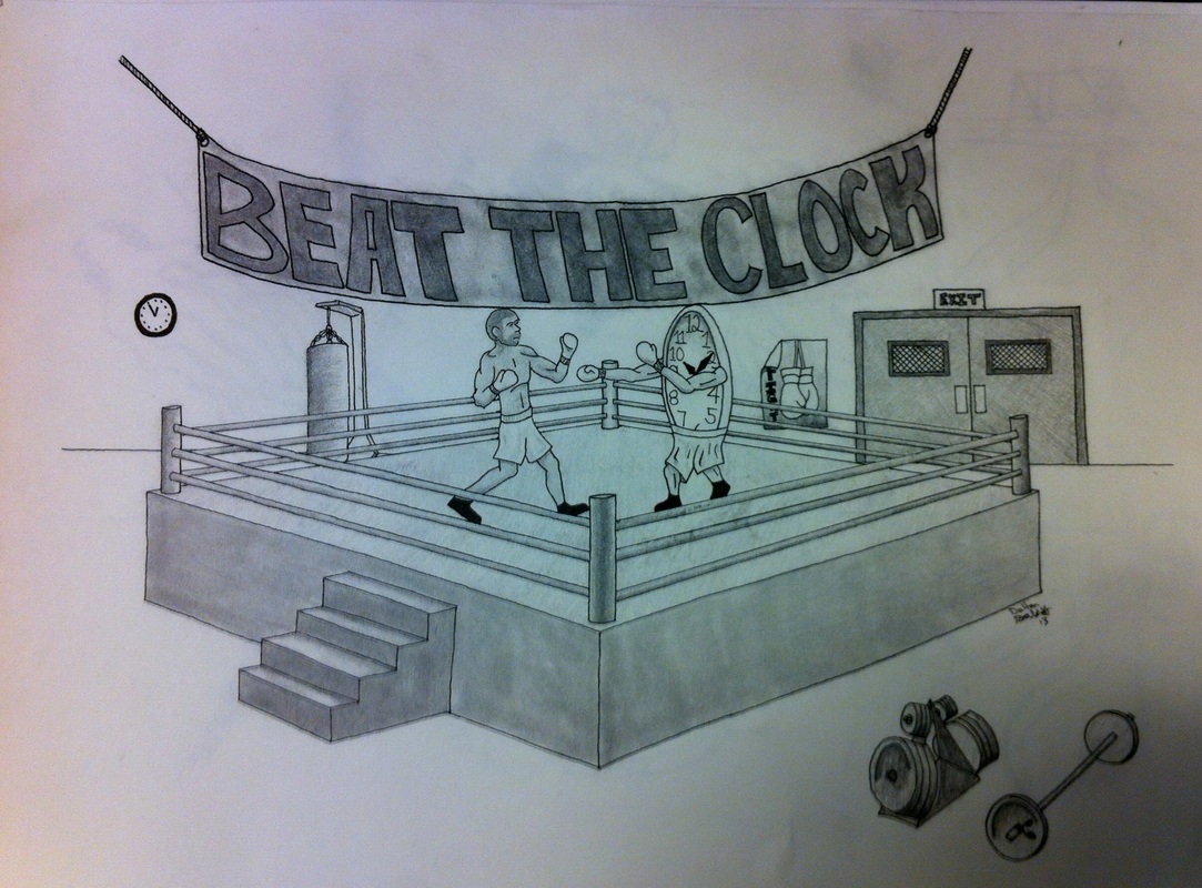
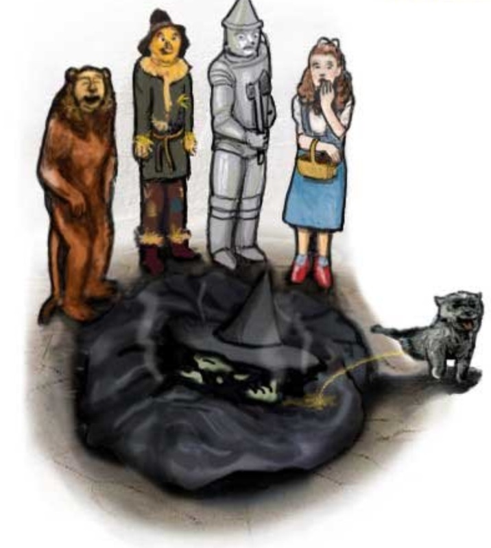
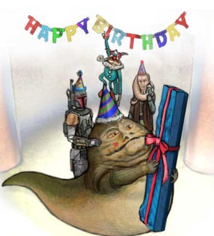
Idiom Illustration
IDIOMS: We have all heard them at one point or another, we have likely said at least one of them at some point in our lives, but my guess is we have rarely stepped back to think about what we were actually saying, or to even recognize what we were saying fell into the category of IDIOM.
What is an IDIOM you say???....
By definition, an Idiom is a combination of words that has a figurative meaning, due to its common usage. An idiom's figurative meaning is separate from the literal meaning or definition of the words of which it is made. Idioms are numerous and they occur frequently in all languages. There are estimated to be at least 25,000 idiomatic expressions in the English Language.
Still wondering???
IN use an idiom sounds like this:
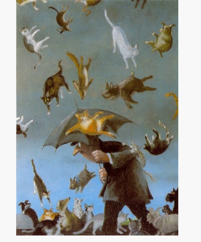
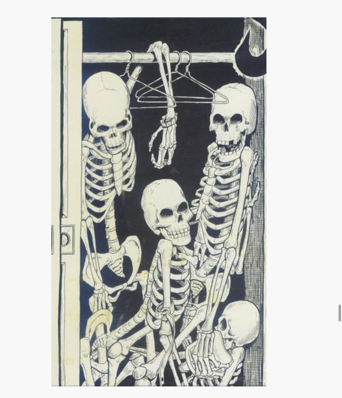
Its raining cats and dogs.....he kicked the bucket.....she has skeletons in her closet....
We understand the accepted meaning of these phrases, yet know they do not actually happen. BUUUUUUUUT...what would it look like if they did?!
WELCOME to your new artistic task!!!! You are about to embark on an illustrative journey into IDIOMS!!!
YOUR JOB:
Find at least 5 Idioms that strike a visual cord in you. Which of these borderline cliche statements can you transform into a NON cliche illustration?!
Whittle it down, eliminate ideas thoughtfully until you arrive at a solidly composed idea that will push your skills AND creatively illustrate your chosen idiom.
BE CAREFUL
Because these statements push a cliche concept, it MAY be easy to fall victim to a cliche representation! AVOID this! Push your composition, your vantage point, your tools, your own personal expression to ensure you are presenting your idiom clearly with your own personal blend of creativity!
What is an IDIOM you say???....
By definition, an Idiom is a combination of words that has a figurative meaning, due to its common usage. An idiom's figurative meaning is separate from the literal meaning or definition of the words of which it is made. Idioms are numerous and they occur frequently in all languages. There are estimated to be at least 25,000 idiomatic expressions in the English Language.
Still wondering???
IN use an idiom sounds like this:
Its raining cats and dogs.....he kicked the bucket.....she has skeletons in her closet....
We understand the accepted meaning of these phrases, yet know they do not actually happen. BUUUUUUUUT...what would it look like if they did?!
WELCOME to your new artistic task!!!! You are about to embark on an illustrative journey into IDIOMS!!!
YOUR JOB:
Find at least 5 Idioms that strike a visual cord in you. Which of these borderline cliche statements can you transform into a NON cliche illustration?!
Whittle it down, eliminate ideas thoughtfully until you arrive at a solidly composed idea that will push your skills AND creatively illustrate your chosen idiom.
BE CAREFUL
Because these statements push a cliche concept, it MAY be easy to fall victim to a cliche representation! AVOID this! Push your composition, your vantage point, your tools, your own personal expression to ensure you are presenting your idiom clearly with your own personal blend of creativity!
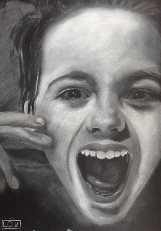
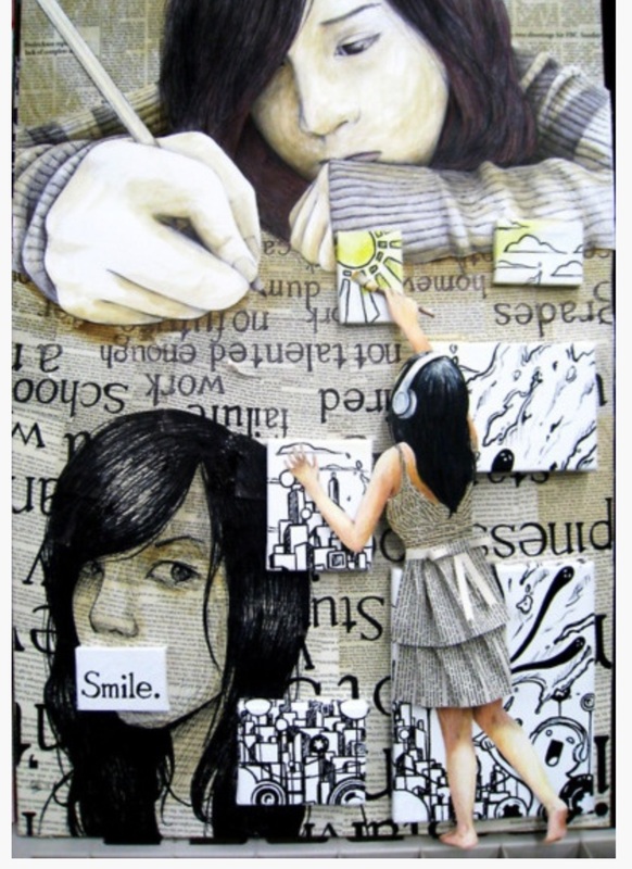
student examples
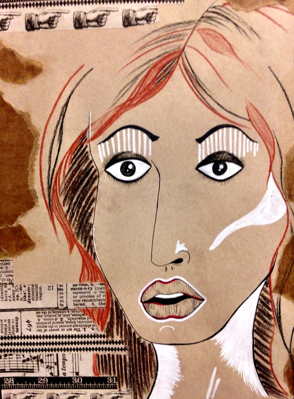
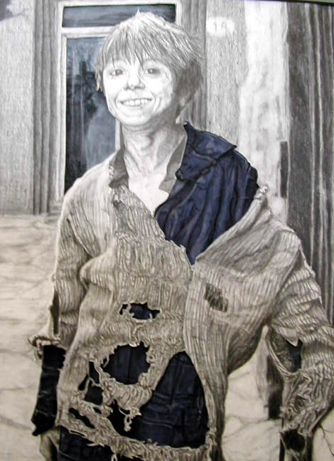
Chalk and Charcoal Portraiture on Toned Paper
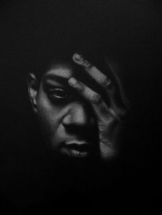
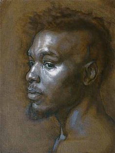
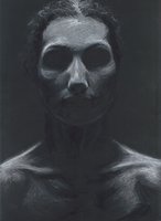
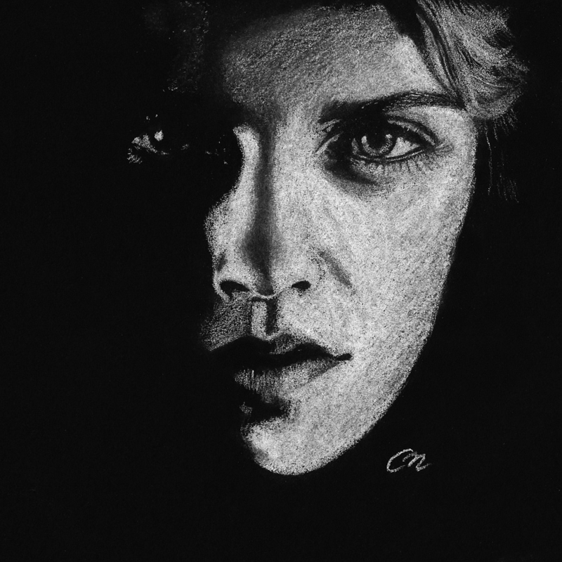
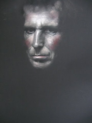
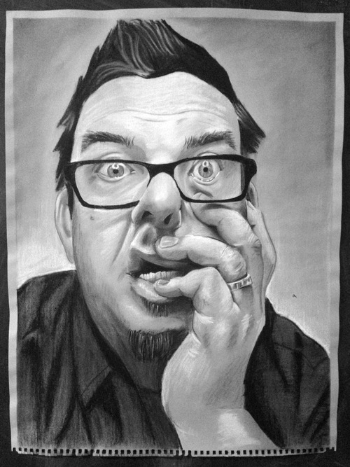
Let's take our traditional practice of portraiture and medium application and flip it on its head.
Where we once pushed shadows and shades, lets here push highlights and crisp features. We will render in reverse..if you will, utilizing chalk and erasers as our drawing tools.
Light on to dark...in big geometric areas, slowly building up the features instead of pushing back the space.
All other rules of portraiture apply....we will now just be drawing the areas we once left blank.
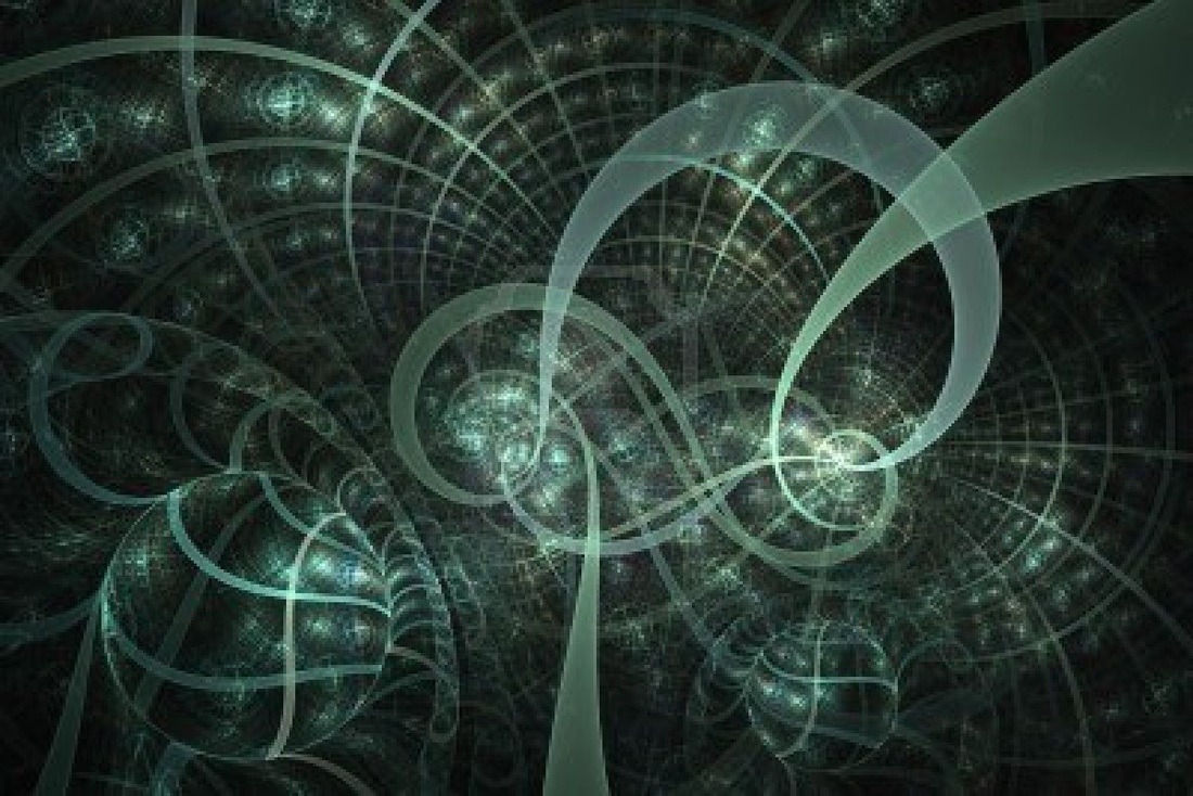
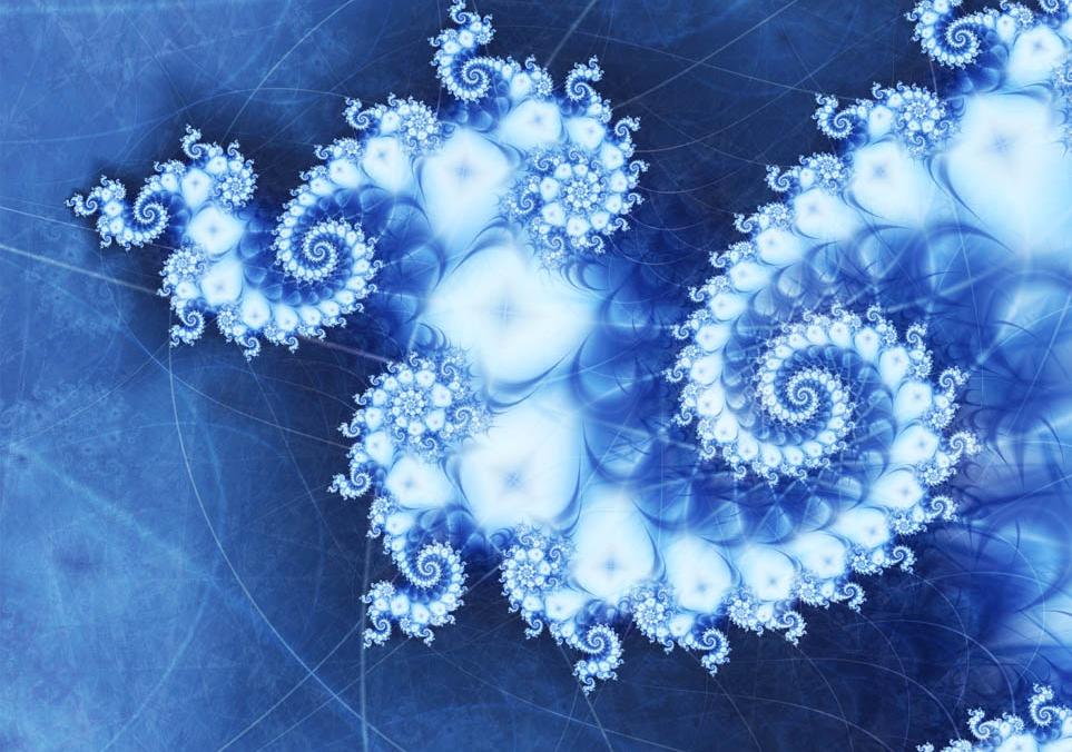
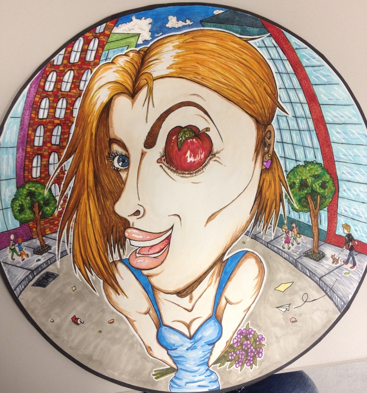
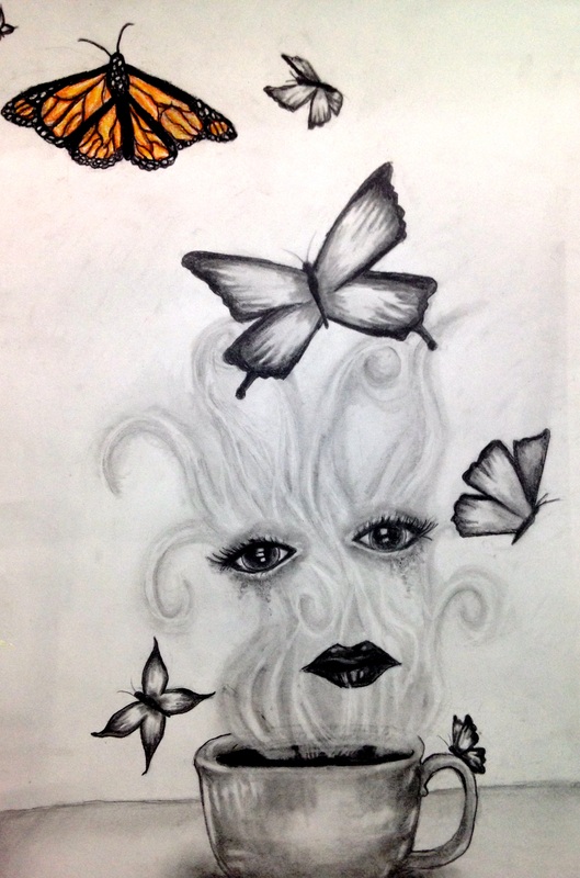
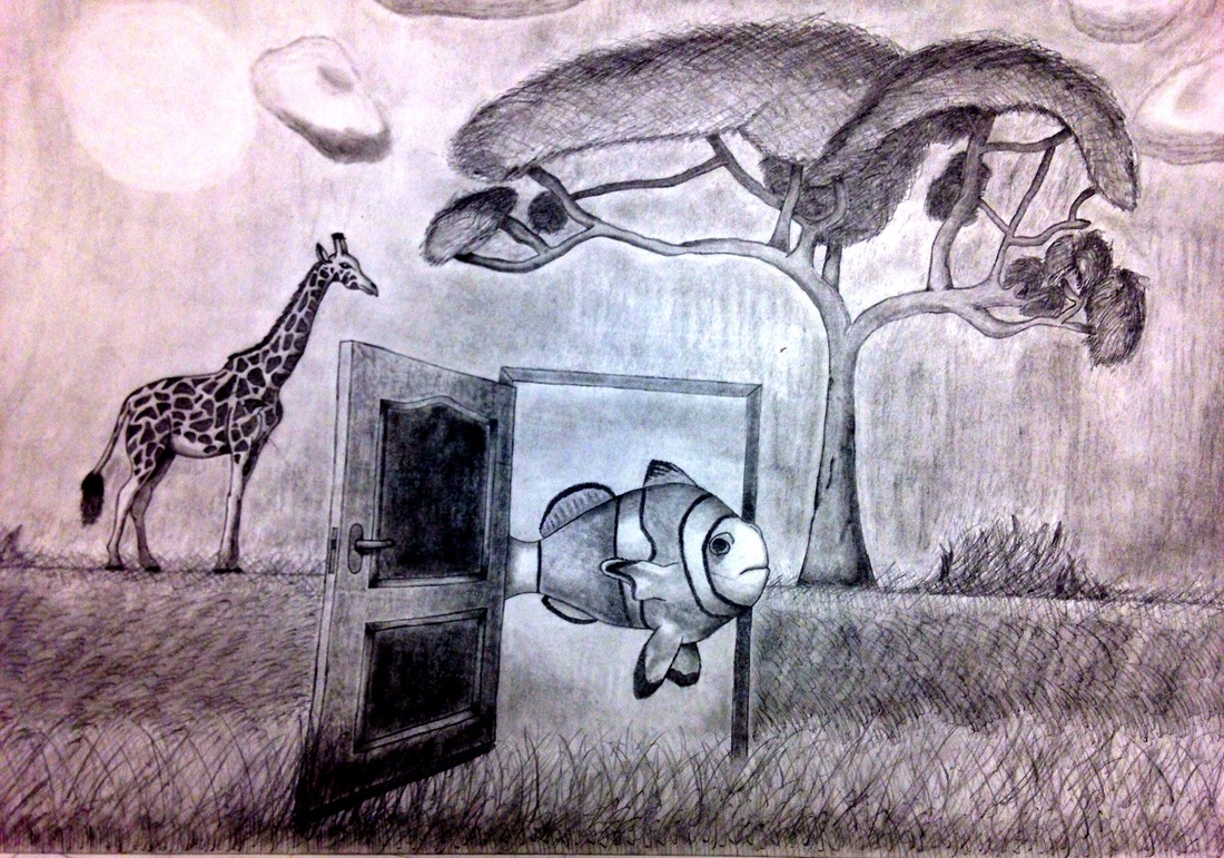
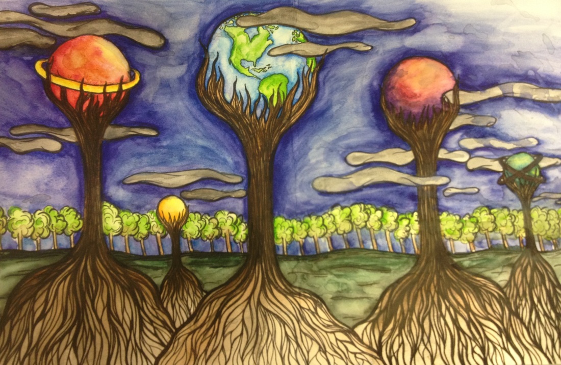
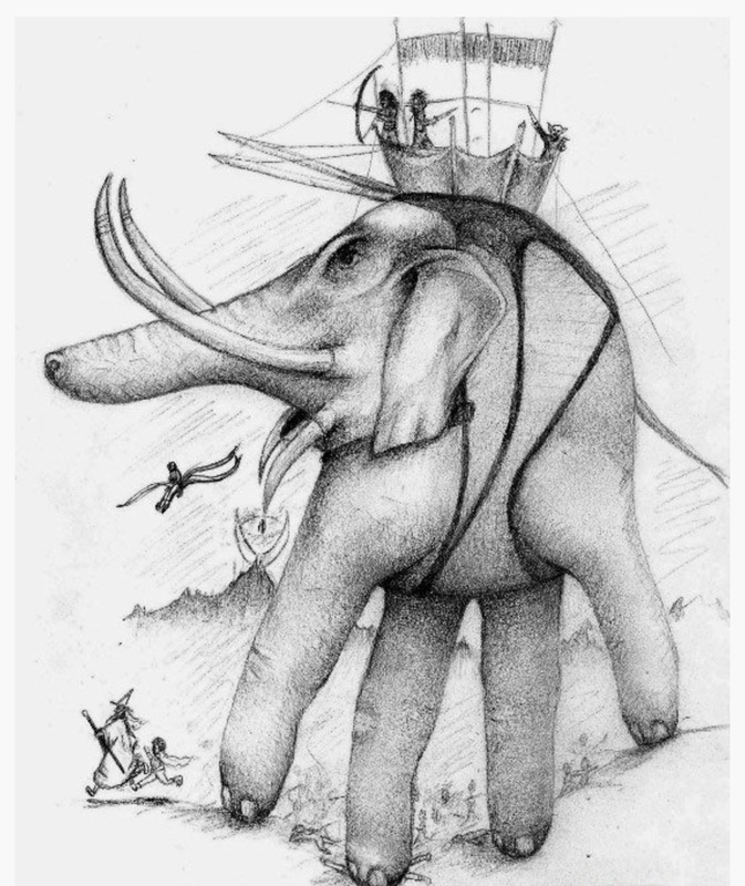
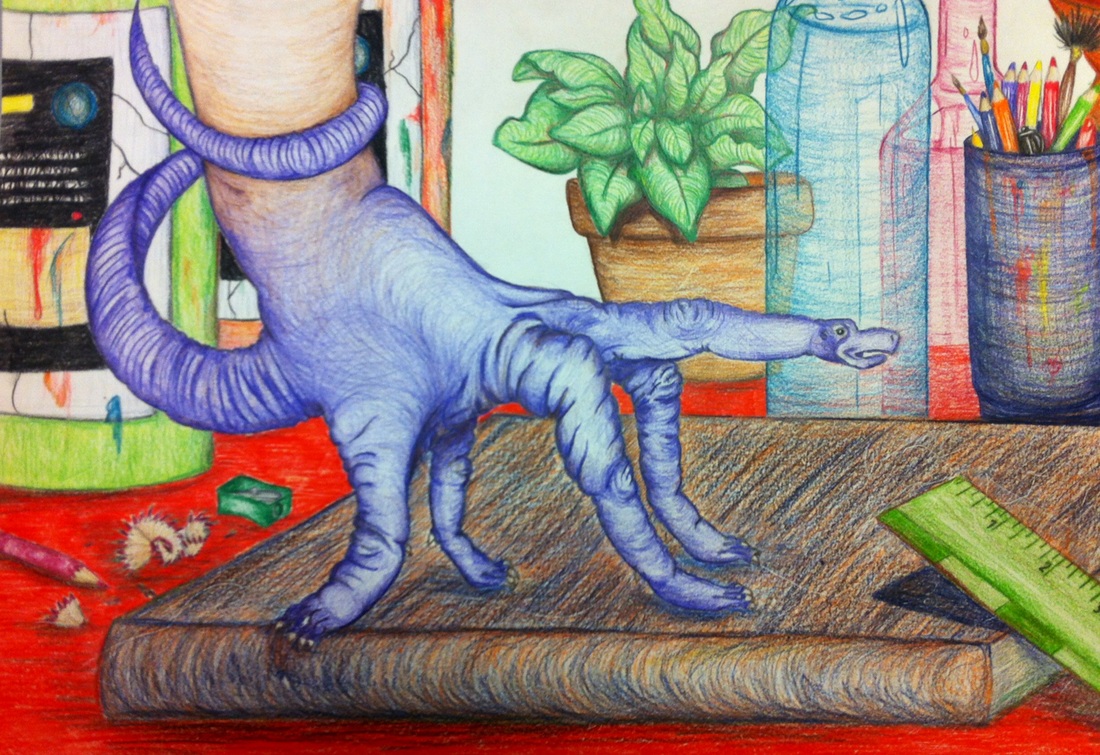
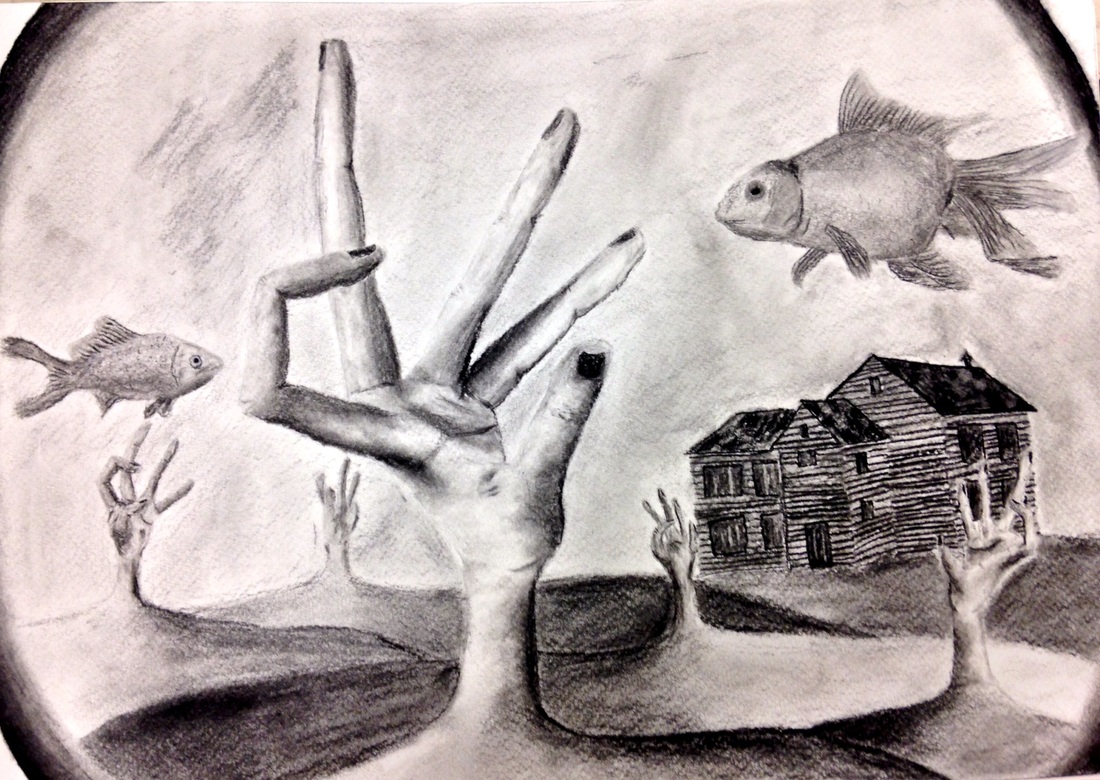
Surrealism as a source of inspiration
Surrealism is a cultural movement that began in the early 1920s, and is best known for its visual artworks and writings. The aim was to "resolve the previously contradictory conditions of dream and reality." Artists painted unnerving, illogical scenes with photographic precision, created strange creatures from everyday objects and developed painting techniques that allowed the unconscious to express itself and/or an idea/concept.[1]
Surrealist works feature the element of surprise, unexpected juxtapositions and non sequitur; however, many Surrealist artists and writers regard their work as an expression of the philosophical movement first and foremost, with the works being an artifact. Leader André Breton was explicit in his assertion that Surrealism was, above all, a revolutionary movement.
Surrealism developed out of the Dada activities during World War I and the most important center of the movement was Paris. From the 1920s onward, the movement spread around the globe, eventually affecting the visual arts, literature, film, and music of many countries and languages, as well as political thought and practice, philosophy, and social theory.
LETS SIMPLIFY.....if you can dream it, then make that dream dance across your canvas.
YOUR JOB : Create a surrealist image of your own design, using materials that will best convey YOUR meaning and idea. At minimum you will create a complete composition that combines 2 juxtaposed/combined objects in order to form a new reality.
BE CAREFUL: Just because anything is possible does not mean you can approach this without a plan. If you want to create a sur-reality, you must think in terms of the whole image as well as the whole viewing experience. First think of the basic ways we interact with reality and standard imagery, and then take your viewer on an unexpected and entirely new journey! Do not copy an idea that is already out there! Explore all of the potential YOU hold inside of YOUR imagination.
student examples
We have to stop avoiding HANDS!!!
We are going to start this process through a series of BLIND CONTOUR drawings. You have heard me say far too many times, in order to draw something, you need to see it. In order to see it, you must LOOK at it.
Often when learning to draw (and perhaps with hands especially) you need to temporarily hold off judgment and try not to second guess what you think the object should look like, rather I want you to see what object actually looks like. When you are trying to learn to draw something realistically, you have to engage your right hand side of the brain, which is keener on images and spatial perception. So lets cut out some external distraction like talking....and looking at the paper...and just focus in linking our eye movement to that of our pencil.
YOUR JOB: Spend one class period just drawing hands. Start with a minimum of 5 blind contours with your hands in varying positions. Move to a more traditional observational style and see how you improve. Then, give yourself time to start shading one of the hands as realistically as possible. At this point, you should be more familiar than ever with the crooks, bends and formations of the hand such that your imagination can pull you elsewhere within the confines of the basic hand structure.
NEXT: Use the hand as the basic structure for an inspired drawing. You can almost consider the high school version of the first grade hand turkey...but clearly more amazing, inspired and technically challenging! No tracing is allowed...but any medium variations are!!! How will YOU express yourself here??? This is a test of your imaginative skills, but also a blend of some of the skills you were pushing in the first two lessons.
BE CAREFUL: Do not fall victim to using any standard hand position! Do not feel confined to a certain composition or a certain boundary. Explore, expand and push your own personal blend of creativity and imagination!
student examples
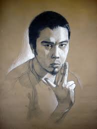
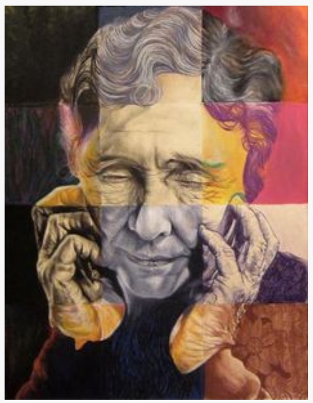
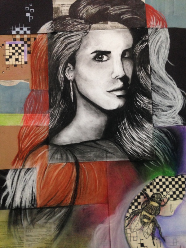
Medium Mash Up
At this point in your drawing "career" it is hopeful that you have found comfort and skill within at least one medium. For most of us, that comfort resides in graphite. For others, colored pencil or ink has been your trusted tool. Either way, in drawing as in life, sometimes we need to push past what is comfortable and safe in order to grow....both as people and as artists. So, NOW is your chance for a safe entry into change....and eventual growth.
YOUR JOB: Find a portrait of someone you find visually interesting. Pick an individual with characteristics that captivate you. Ensure something pulls you into the imagery of who they are. (lines, features, expression). It can be a self portrait, it can be a portrait you have taken, or it can be an image from online. While I prefer the first two, this is an advanced warm up, so the image need not be original.
NEXT, you will do a light pencil drawing to layout the portrait on an 18x24 paper.
From here, you need to break your portrait into multiple sections. If you look below, you see the artist measured in very specific squares. You may choose to do this or you may choose to be a bit looser, just so long as you wind up with an approximate 12 sections.
From there, you will be adventuring into a wide variety of mediums, to be blended and perfected in each of the sections. (pencil, charcoal, ink, crayon, chalk pastel, oil pastel, colored pencil, etc)
BE CAREFUL: You will want to ensure the sections come together nicely and transition with ease. Consider how you will do this as you get to the section dividers. Also, consider which mediums are likely to make a "mess". Where will you put those, and when will you apply those to your paper? Be somewhat strategic here.
student examples
Mix up the Mash Up
student examples
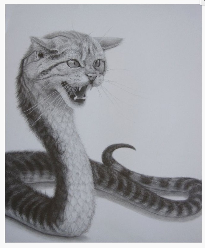
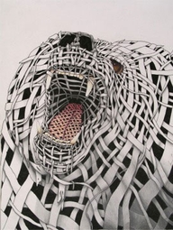
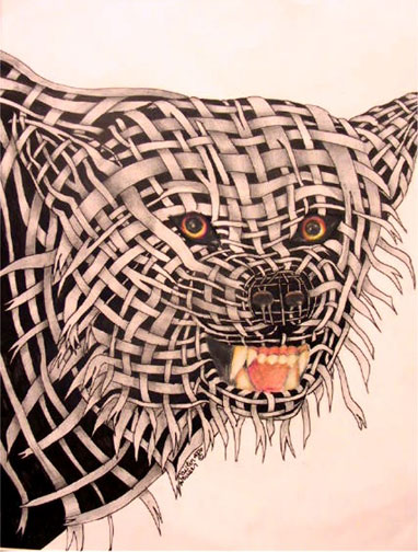
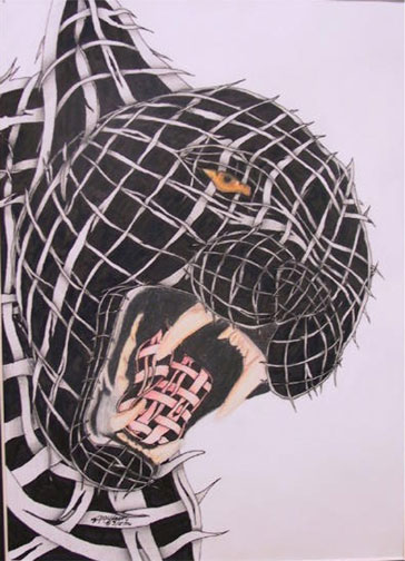
Wrapped Animal Portrait
BASIC PROJECT DESCRIPTION
Students will select a high interest animal portrait.
After completing an accurate light line drawing, the portrait will be finished using contours lines constructed of implied wrapping using pencil and pen.
The eyes will be completed in colored pencil.
STANDARDS WE WILL HIT:
STEPS – This instructs you step by step on the procedures to follow so you may successfully complete this project.
1) Select a high interest animal portrait. Snarling animals are suggested.
2) Complete a light line drawing that is accurate and uses up at least ¾’s of the paper surface.
3) After viewing the slides of this project (anchor set/best practices), begin drawing in the contour lines that will be used as guides for your wrapping. A weaving type style/pattern is required on this project. The “wrapping” should vary in length and width. This should be done to both create contrast in the weaving as well as work with the patterns of dark and light in your original image.
4) Once all the pencil work is completed, carefully go over the lines with pen and ink. Fill in the negative spaces with ink.
5) Begin shading the wrapping with your pencil. Think of how the light would work with the bottom, middle and top wrapping. Be careful to not smear your work.
Students will select a high interest animal portrait.
After completing an accurate light line drawing, the portrait will be finished using contours lines constructed of implied wrapping using pencil and pen.
The eyes will be completed in colored pencil.
STANDARDS WE WILL HIT:
- STUDENTS RECOGNIZE AND USE THE VISUAL ARTS AS A FORM OF COMMUNICATION.
- STUDENTS KNOW & APPLY ELEMENTS OF ART, PRINCIPLES OF DESIGN & SENSORY & EXPRESSIVE FEATURES OF VISUAL ARTS.
- STUDENTS KNOW & APPLY VISUAL ARTS MATERIALS, TOOLS, TECHNIQUES & PROCESSES.
- STUDENTS RELATE THE VISUAL ARTS TO VARIOUS HISTORICAL AND CULTURAL TRADITIONS.
- STUDENTS ANALYZE & EVALUATE THE CHARACTERISTICS, MERITS & MEANINGS OF WORKS OF ART.
STEPS – This instructs you step by step on the procedures to follow so you may successfully complete this project.
1) Select a high interest animal portrait. Snarling animals are suggested.
2) Complete a light line drawing that is accurate and uses up at least ¾’s of the paper surface.
3) After viewing the slides of this project (anchor set/best practices), begin drawing in the contour lines that will be used as guides for your wrapping. A weaving type style/pattern is required on this project. The “wrapping” should vary in length and width. This should be done to both create contrast in the weaving as well as work with the patterns of dark and light in your original image.
4) Once all the pencil work is completed, carefully go over the lines with pen and ink. Fill in the negative spaces with ink.
5) Begin shading the wrapping with your pencil. Think of how the light would work with the bottom, middle and top wrapping. Be careful to not smear your work.
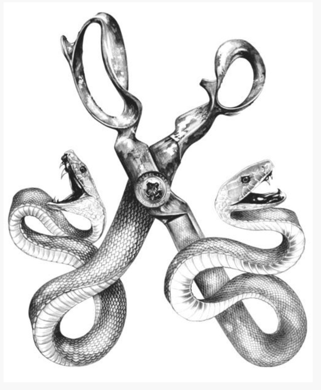
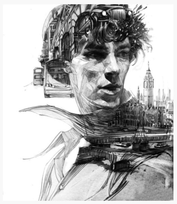
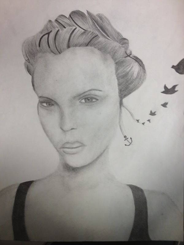
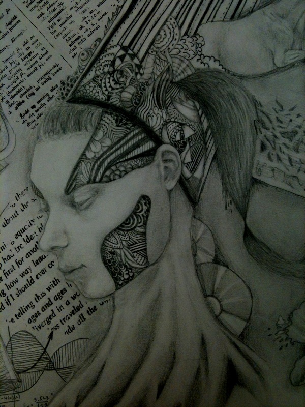
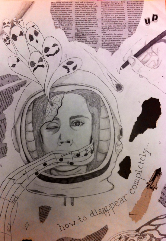
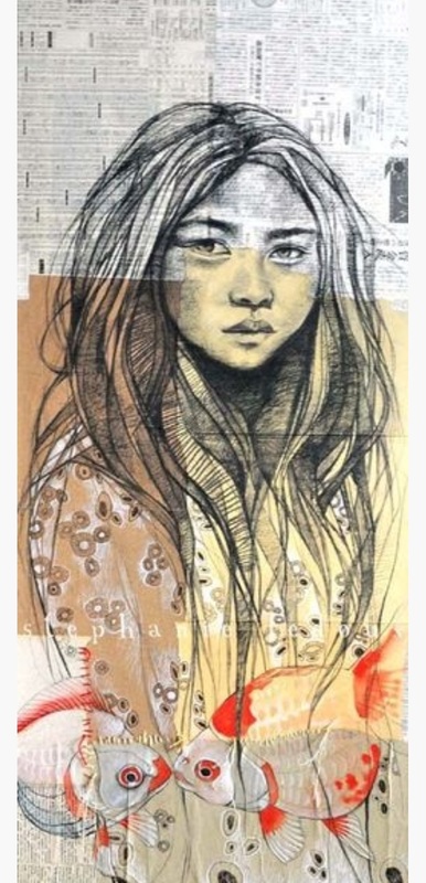
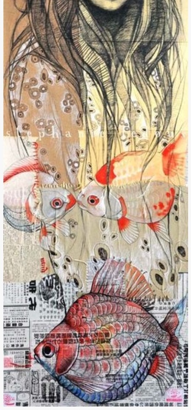
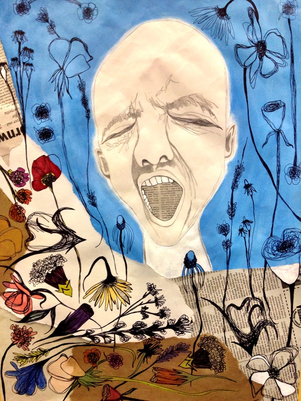
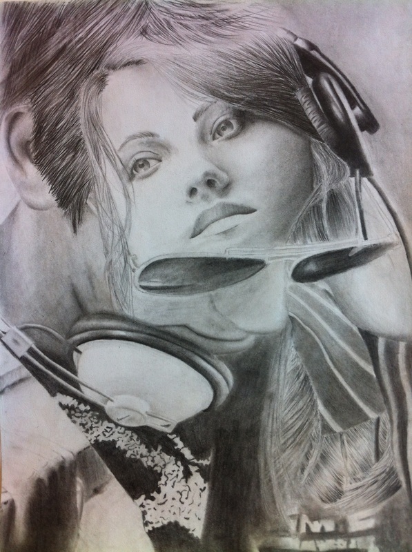
Woven Drawing/Blended Drawing
In essence, what im asking you to do, is make a statment by blending two images into one cohesive whole. The places you can go with this are endless. The potential for visual impact is great. The moment for taking a personal stance and making it visual is now. It is up to you to take this moment and give it your own version of visual power.
The choice of your two images is the first step in deciding what you want to say.
Will your images compliment each other?
Will they contrast each other?
Will your images make an emotional statement?
Will they take a personal stance on a particular issue?
Once you have chosen your images, spend some time figuring the most effective way to blend the images.
Which parts are essential to be seen?
Which elements must you push to the foreground?
What areas are best for blending such that the two images become truly one?
How will the blending become seamless and encourage the viewer to take a second, third, or fourth look?
MATERIALS
pencil, paper, tortillons, eraser, colored pencil (choice), visual references
* this is a route you could take for a slightly less seamless image if you are having trouble with the free flow design option:
1. Choose two pictures that have a common theme or idea. Find one that is predominantly darker and the other lighter. Cut them to the same size in something that is in even inches.
2. Cut the first picture into vertical 1" strips keeping them together at the top.
3. Cut the second picture horizontally in 1" strips.
4. Tape the vertical one onto some scrap paper on the top and weave the other picture over and under (traditional tabby weave). Square it up tightly and then tape it on the sides. Repeat this until all the picture is done.
5. Tape around all for sides with masking tape and begin to reveal some squares to show more of one picture and so forth until you like the composition. You can eliminate rows and squares that are not important.
6.Transfer the design with graphite onto white drawing paper and begin to draw each square.
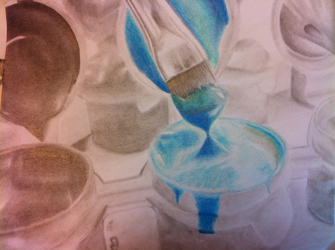
Pierced Drawing
The idea of a pierced drawing is to create a drawing in which one or more areas are "cut out" and colored pencil is inserted in place of standard value. Learning a bit of color theory, and pushing observation and color techniques, you should be able to create a striking point of interest. The subject matter selected has the potential to make quite a statement if you choose carefully and thoughtfully. Think about what is important to you. Think about all the things you can say with just imagery. Think about what you have the power to encourage people to focus on. Approach your content with the idea that the pierced area is the most import part of the composition. Choose carefully to make a good project.
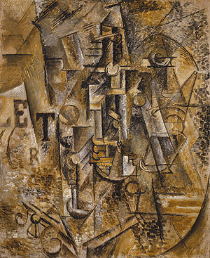
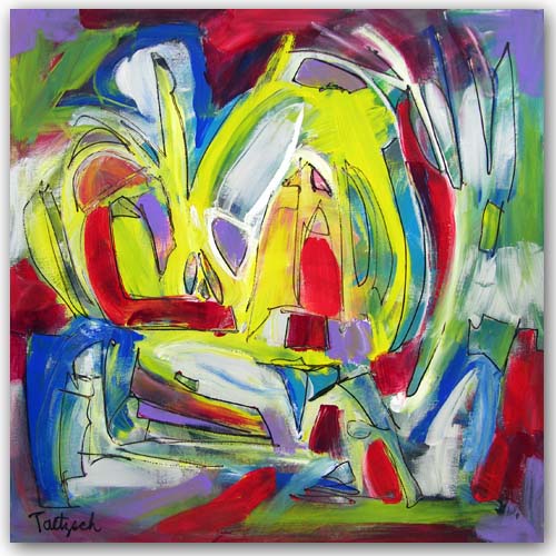
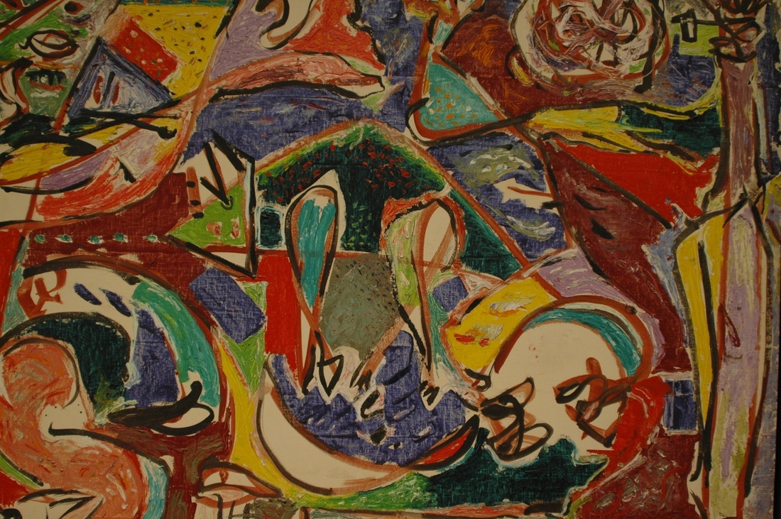
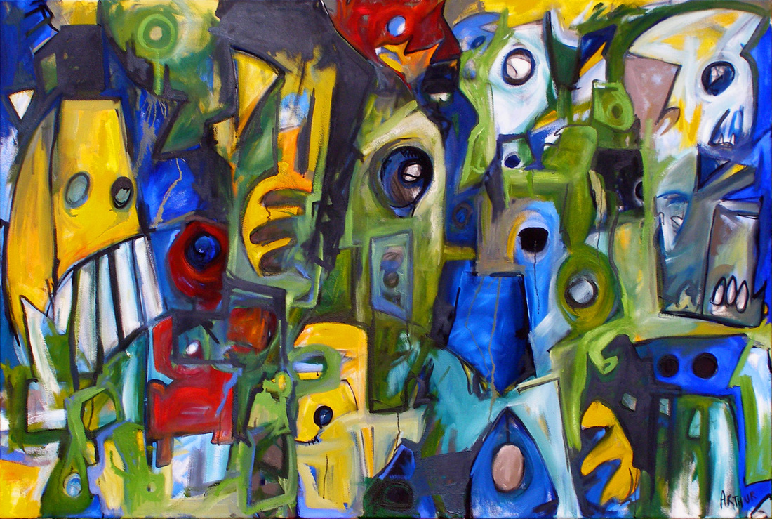
Redefine Glue
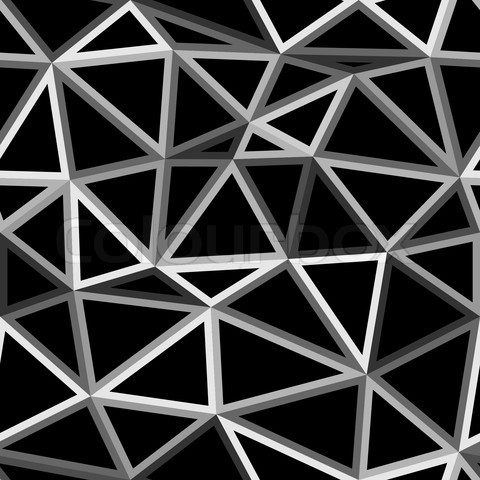
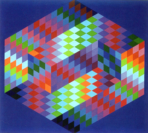
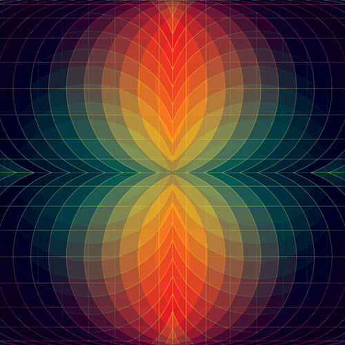
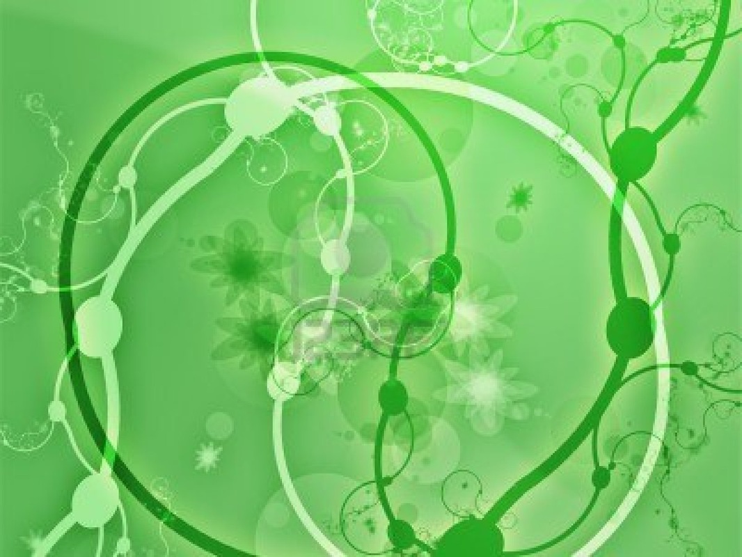
1: In order to arrive at your personal, original design, please research the following on google images or something of the like:
GEOMETRIC DESIGN
ORGANIC DESIGNCUBISM
ABSTRACT EXPRESSIONISM
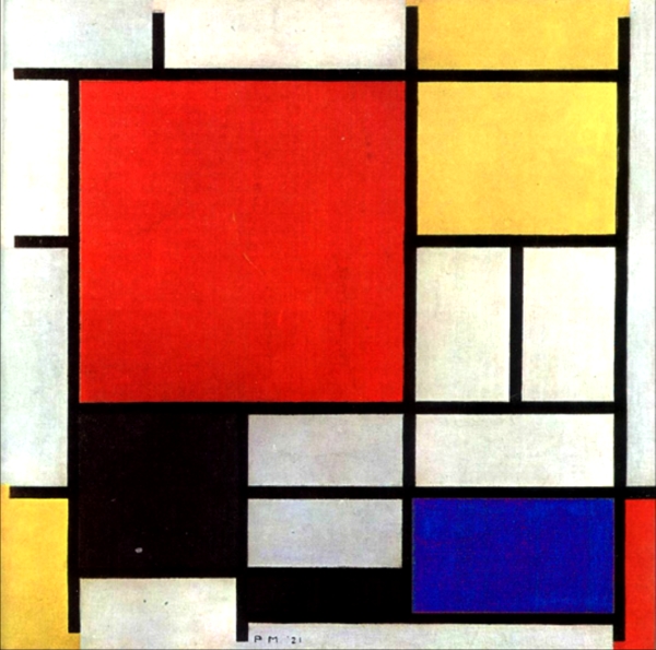
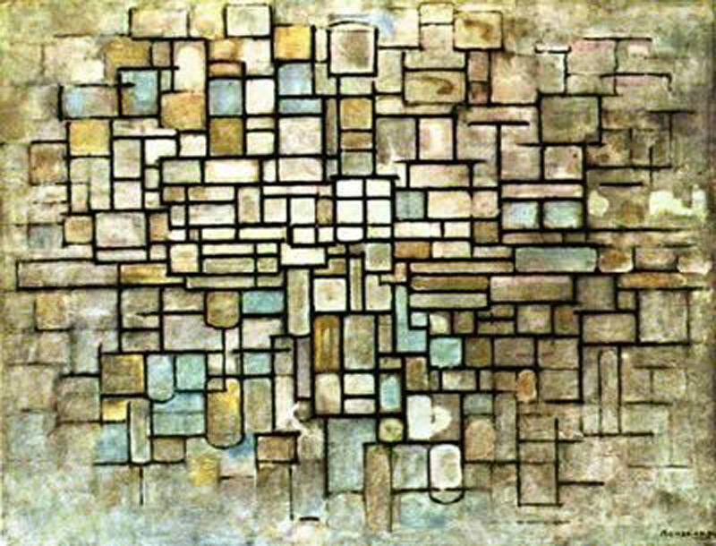
MONDRIAN
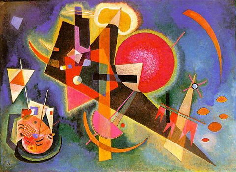
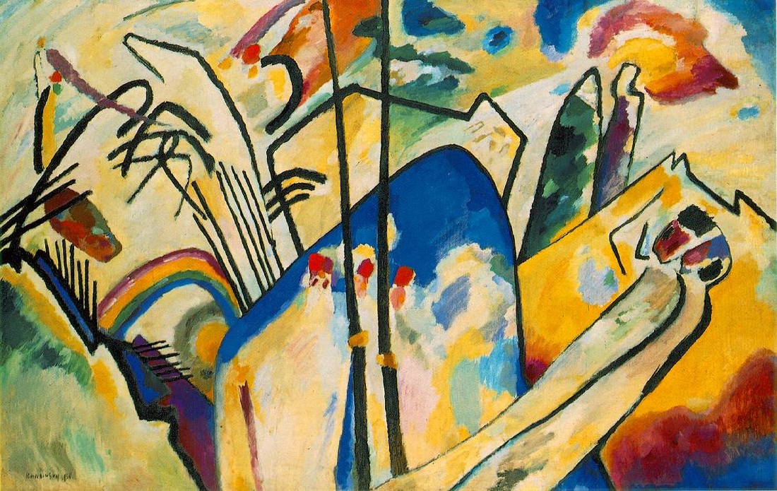
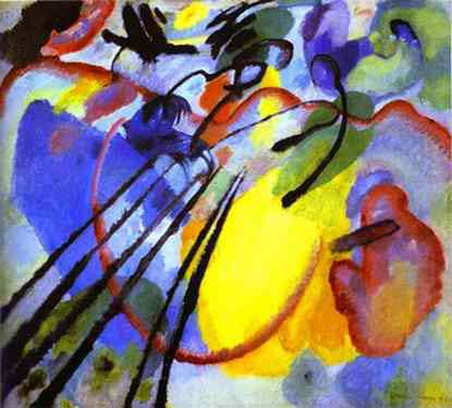
KANDINSKY
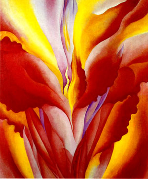
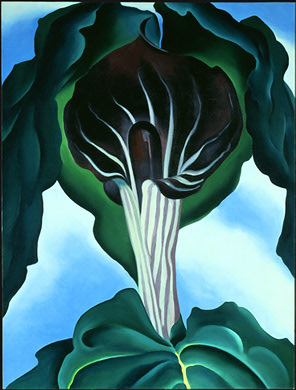
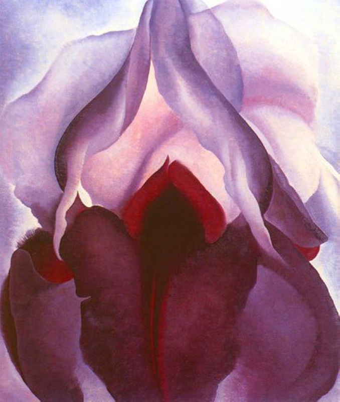
GEORGIA OKEEFFE FLOWERS
Find what motivates you visually. Observe the colors and the use of line. How does the artist move you throughout the visual space? How does the artist maximize composition? How can you use this art as inspiration for your own design?
2: Create at least 3 THUMBNAIL SKETCHES
After you feel comfortable and comfortably motivated, move on to thumbnail sketches. Sketch out some design ideas and rough compositions. Make note of potential color usage.
3: Discuss your ideas and decide on a plan
4: Move to the 18x24 black construction paper, sketch your design, trace it/re draw it with glue
5: After the glue dries, color (using similar color theory techniques from the colored pencil project) with CHALK PASTEL.
Please limit your palette for effect and a more cohesive visual unity.
GEOMETRIC DESIGN
ORGANIC DESIGNCUBISM
ABSTRACT EXPRESSIONISM
MONDRIAN
KANDINSKY
GEORGIA OKEEFFE FLOWERS
Find what motivates you visually. Observe the colors and the use of line. How does the artist move you throughout the visual space? How does the artist maximize composition? How can you use this art as inspiration for your own design?
2: Create at least 3 THUMBNAIL SKETCHES
After you feel comfortable and comfortably motivated, move on to thumbnail sketches. Sketch out some design ideas and rough compositions. Make note of potential color usage.
3: Discuss your ideas and decide on a plan
4: Move to the 18x24 black construction paper, sketch your design, trace it/re draw it with glue
5: After the glue dries, color (using similar color theory techniques from the colored pencil project) with CHALK PASTEL.
Please limit your palette for effect and a more cohesive visual unity.